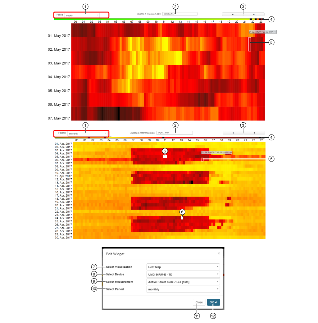
Heat Map


images/download/attachments/251037644/W_Heat-Map_EN-version-1-modificationdate-1519897650000-api-v2.png

The heat map:

  • Shows a quantity in the form of its heat image. The measurement values of the quantities are displayed in the color spectrum of a thermometer (spectral analysis) - from green to yellowish orange to dark red.

  • Serves to gain an overview of a number of measurement values intuitively and to notice especially significant values more easily.

Position

Description

1

  • Display of the recorded timeframe (cf. Setting Select Timeframe Pos. 10) for the quantity.

  • Settings:
    - weekly (upper heat map, Y-axis of the heat map = 1 week).
    - monthly (lower heat map, Y-axis of the heat map = 1 month)
    .

  • The display starts at Reference Date (Pos. 2).

2

  • Starting time (Starting date) for the presentation in the heat map (of the quantity).

  • Entry options: Keyboard or Date Picker.

  • Depending on the Timeframe (cf. Pos. 1 and 10).

3

  • Previous (<) or Next (>) timeframe (depending on the timeframe setting - Pos. 1/10).

4

  • 4 sliders for individually adjusting the thresholds and their color schemes.

  • Hold the mouse cursor over a slider to see the thresholds.

  • The grid points are divided along a 24-hour scale (X-axis of the heat map).

5

  • Hold the mouse cursor over a grid point in the heat map.

  • Shows Day, Time, Measurement value for the respective grid point.

6

  • No measurement.

7

  • Selection of the Widgets (visualization).

  • Heat Map selected.

8

  • Select device.

  • Includes all devices with memory (historical data) in your project.

9

  • Selection of the quantity.

10

Standard setting for the display in the recorded timeframe (cf. Pos. 1 Timeframe):

  • weekly (upper heat map).

  • monthly (lower heat map).

11

  • Closes the assistant Edit Widgets without saving the entries.

12

  • Saves your configuration.

  • The Widget appears on the Dashboard.