Regression Analysis
![]()
Application Example Regression Analysis
In this example, a regression analysis is performed and the result is interpreted. A regression analysis is used to examine whether and to what degree two values correlate. This allows suspected correlations to be either confirmed or negated.
The regression line can be used to calculate a forecast value. As a matter of principle, a regression analysis can be performed with any two values. It is recommended that values be used between which a correlation is suspected.
This example is based on the application example for the Master Page and Data Objects and uses the same report. You can also create a new report for this example.
Data Basis
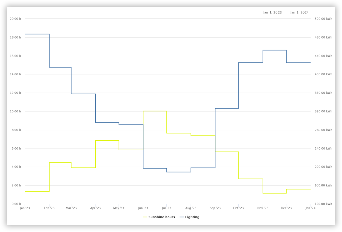
In this regression analysis, the average monthly hours of sunlight in the year 2023 are compared with the corresponding energy demand for office lighting. Sunlight hours are defined as the time periods in which the sun shines with no obstruction.
The time histories of the two measurement values are shown in the figure on the right. The supposition is that less energy is required for lighting the more frequently the sun shines. This supposition is to be examined using the regression analysis.
Preparation
Make sure that all the measured values you want to use are available in GridVis Web. If necessary, use the Data Import (DI) .
Bear in mind that settings such as the aggregation depend on the desired application purpose. Deviate from this example as needed.
Getting Started
Add a new Page to the report.
Note
Activate the grid to arrange objects easily and accurately.
Use the object colors in the report settings to customize the report to suit your company CI.
Perform the Regression Analysis
In the report navigator, click on the Page that is to contain the regression analysis. In this example, the regression analysis is intended to fill the entire page.
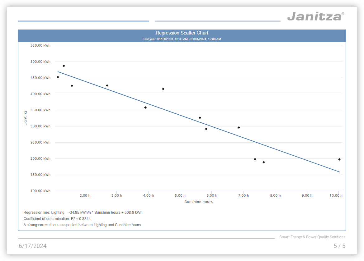
Place the object Regression Scatter Chart on the page. Arrange it so that it fills the entire page.
Activate the display of the title and status bar and the frame.
Select the measurement values that are to be used in the analysis. The first entry in the list of the selected measurement values is used for the X-axis, the second for the Y-axis. Ensure the orientation is correct and modify it as needed using drag-and-drop. In this example, the lighting is second. This means that the energy demand for lighting is shown as a function of the sunlight hours in the chart.
Assign meaningful display names for the measurement values. Remove all entries from the Legend field to use only the display name as the label for the axis.
Set a suitable scaling and the correct measurement value properties.
Click Save, to add the measurement values to the chart.Set the aggregation you need for your application purpose. This example uses the aggregation Month.
Set the time period you wish to examine. If needed, deviate from the time period in the report. This example uses the year 2023 as the time period.
Deactivate display of the legend.
Activate display of the regression result and the axis label.Check the distances to the header and footer.
Note
Use a meaningful page name for a clear report navigator.
Use meaningful object names for a clear object list.
If the report is to be printed, take the non-printable page areas into account in your printer settings.
Result
Up to three items of information are shown below the chart: The regression line, the coefficient of determination and, for strong correlations, an interpretation of the coefficient of determination.
Regression line
The regression line is a best-fit line between the individual measurement points. It can be used to calculate a forecast value. This example shows that with an increase in sunlight hours, the energy demand for lighting sinks.
Calculation example:
Lighting = -34.95 kWh/h * sunlight hours + 508.6 kWh.
With 6 hours of sunlight, it is expected that -34.95 kWh/h * 6 h + 508.6 kWh = -209.7 kWh + 508.6 kWh = 298.9 kWh will be required per month for lighting.
Bear in mind that the quality of the forecast depends on the data used. For a precise forecast in this example, a precise value for the sunlight hours is required. This, in turn, requires a precise weather forecast. Consequently, the quality of the forecast for the energy demand for lighting ultimately corresponds to the quality of the weather forecast used.
Coefficient of determination
The coefficient of determination, R², indicates how strong the correlation is between the measured values. R² varies in the range of between 0 and 1. The closer the value is to 1, the stronger the correlation. In this example, R² is 0.8844, which means there is a strong correlation between the sunlight hours and the energy demand for lighting.