Data Objects
![]()
Time selection
Data objects use historical measured values. They can also be used to display live values on dashboards. For both historical measured values and live values, you can use either the defaults of the report or dashboard, or deviate from these individually per object.
You can find this setting in the Time selection group in the object settings.
CO2 emissions, costs and energy equivalences
After you have created a Contract file you can use data objects to visualize your CO2 emissions, costs and energy equivalences. You can find out how to configure the selected data objects for this in the Measured value selection .
ABC analysis (Pareto chart) (from GridVis edition Expert)
An ABC analysis (also called Pareto chart) can be used to determine the consumers with the largest shares of the total consumption. In the corresponding object, measured values of the same type are displayed as bar charts arranged by size. The selected measured values together result in the total quantity under consideration. In addition, a percentage (Pareto value) can be calculated for each bar, which corresponds to the share of the total of all bars up to this point.
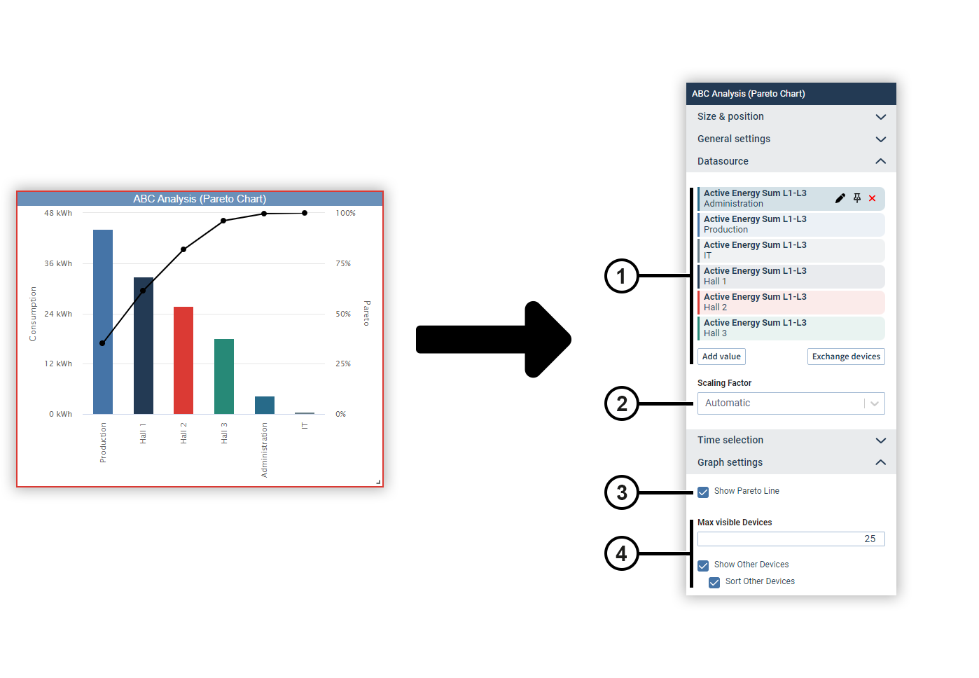
|
Position |
Description |
|
1 |
Displays the selected measured values with display name, source device and color. Move the mouse over a data source to edit or remove it (see
Measured Value Selection
). Data sources can be pinned on dashboards. Devices from pinned data sources remain unchanged in the dashboard’s presentation mode. This allows you to make comparisons during the presentation, for example, using the temporary device swap. |
|
2 |
Automatically determines the scaling of the measured values or sets a fixed scaling factor. |
|
3 |
Displays the Pareto values in the chart. |
|
4 |
Defines the maximum number of devices displayed.
Devices not shown become the entry Other devices in summary form. |
Bar chart
You can use a bar chart to display measured values of the same type as bars and set them in relation to each other. The measured values are sorted by size.
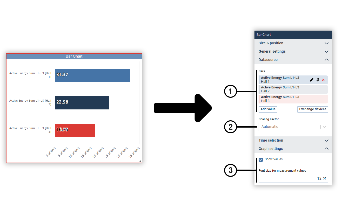
|
Position |
Description |
|
1 |
Displays the selected measured values with display name, source device and color. Move the mouse over a data source to edit or remove it (see
Measured Value Selection
). Data sources can be pinned on dashboards. Devices from pinned data sources remain unchanged in the dashboard’s presentation mode. This allows you to make comparisons during the presentation, for example, using the temporary device swap. |
|
2 |
Automatically determines the scaling of the measured values or sets a fixed scaling factor. |
|
3 |
Specifies whether and how the measured value is displayed in the chart. |
CO₂ calculation (from GridVis edition Expert)
The CO₂ calculation object multiplies a measured value by a CO₂ emission factor and outputs the resulting emission quantity. You can optionally add further information to the measured value.
Note
As of GridVis version 9.1.40, you display CO₂ values by configuring the Numerical value object with energy contracts. We recommend replacing existing CO₂ objects with Numerical value objects.
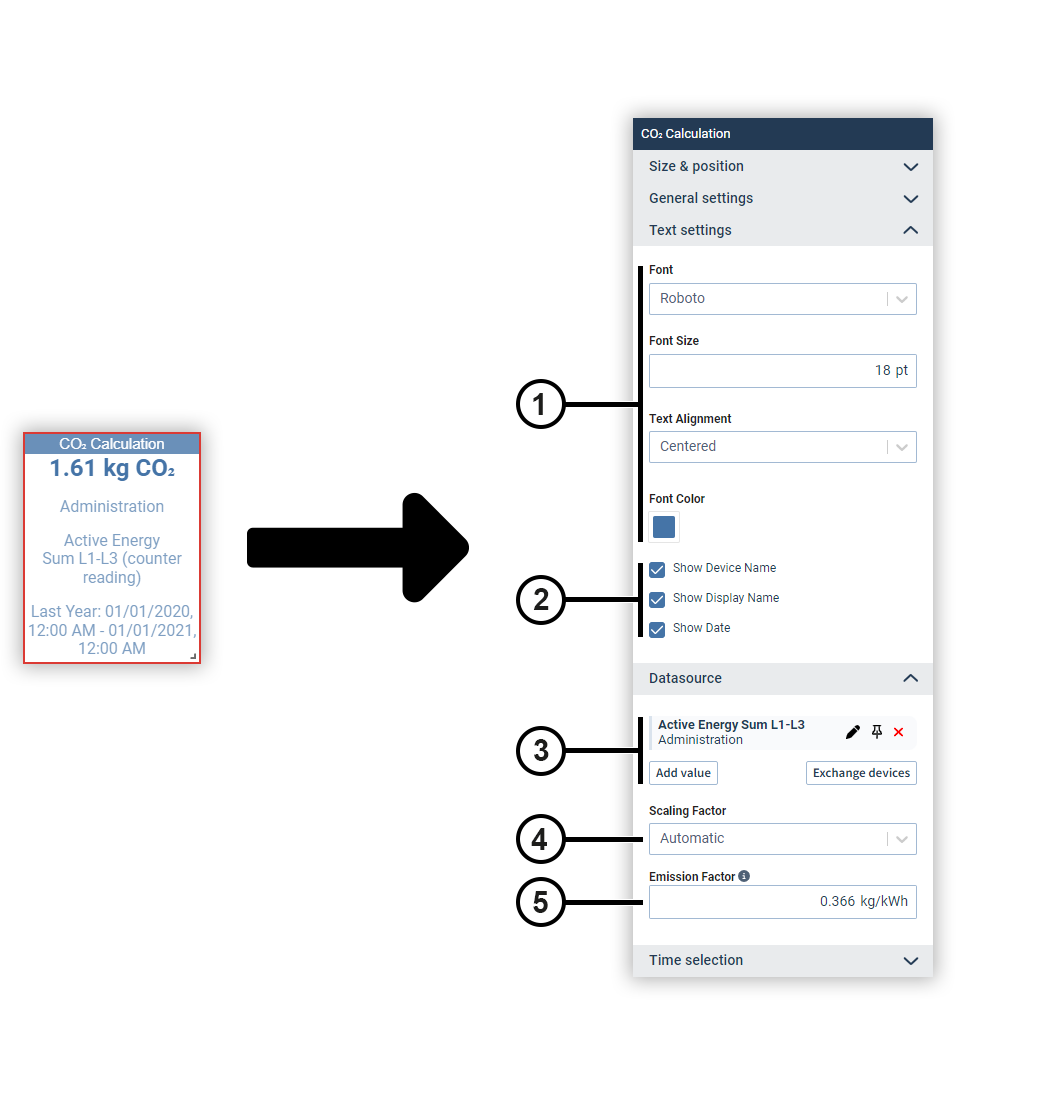
|
Position |
Description |
|
1 |
Sets the text formatting. |
|
2 |
Defines which additional information about the measured value is displayed. |
|
3 |
Displays the selected measured values with display name, source device and color. Move the mouse over a data source to edit or remove it (see
Measured Value Selection
). Data sources can be pinned on dashboards. Devices from pinned data sources remain unchanged in the dashboard’s presentation mode. This allows you to make comparisons during the presentation, for example, using the temporary device swap. |
|
4 |
Automatically determines the scaling of the measured values or sets a fixed scaling factor. |
|
5 |
Defines the emission factor. Current CO₂ emission factors can be obtained from your energy provider, the Federal Environmental Agency or a comparable authority. |
Code (for dashboards only)
The Code object lets you use HTML, JavaScript or CSS on the dashboard. For example, you can call up measured values via the REST interface .
Attention!
The extended security for dashboards prevents potentially malicious scripts from being loaded from other websites or potentially malicious code being executed by dashboard elements (see System settings )!
Note that this will prevent certain functions from being available, such as embedding maps or web pages that require a login (including GridVis internal pages)!
Before disabling this protection mechanism, make sure that the code used has been implemented by trustworthy persons and does not represent any threat!
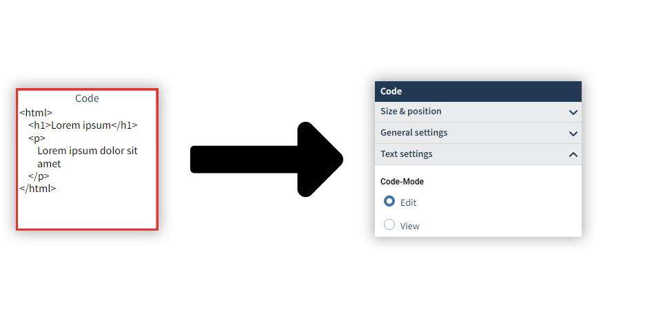
Double-click the object to edit the code in edit mode.
Duration curve (from GridVis edition Expert)
The duration curve is used to arrange the measured values in the order of their magnitude. This allows you to determine the frequency of certain value ranges.
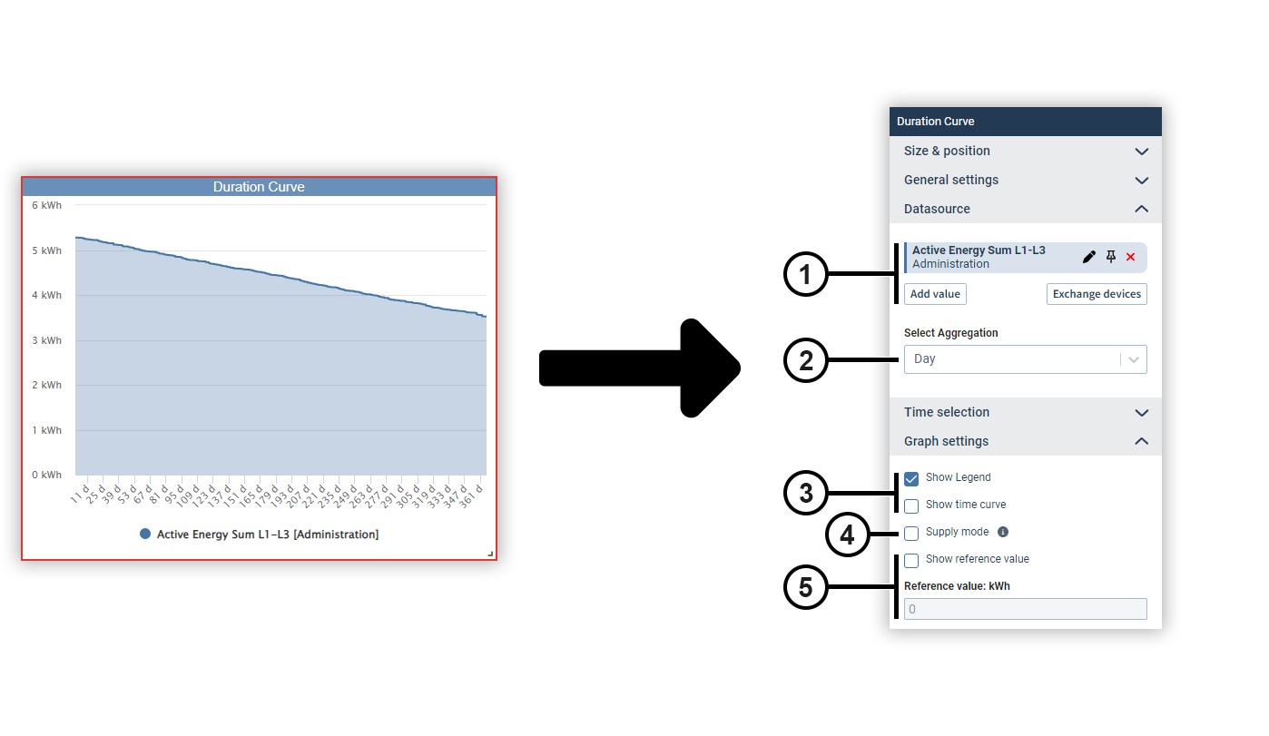
|
Position |
Description |
|
1 |
Displays the selected measured values with display name, source device and color. Move the mouse over a data source to edit or remove it (see
Measured Value Selection
). Data sources can be pinned on dashboards. Devices from pinned data sources remain unchanged in the dashboard’s presentation mode. This allows you to make comparisons during the presentation, for example, using the temporary device swap. |
|
2 |
Defines the aggregation of the measured values. |
|
3 |
Defines the way the chart is displayed. |
|
4 |
Displays negative energy values correctly. |
|
5 |
Displays a threshold value line in the chart. The threshold value can be set as needed. |
Event list
The event list shows all events and transients of the selected device as a table.
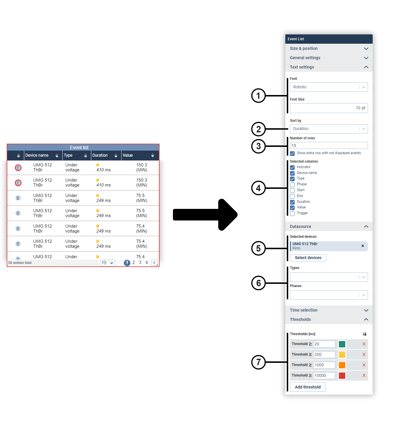
|
Position |
Description |
|
1 |
Sets the text formatting. |
|
2 |
Defines how the events and transients are sorted in the table. |
|
3 |
Defines how many row are displayed in the table. |
|
4 |
Defines which columns are displayed in the table. |
|
5 |
Displays the selected device. Move the mouse over the device to remove it. |
|
6 |
Filters the displayed events and transients by their type and the phase in which they occurred. |
|
7 |
Sets the color marking of the duration of events. |
Heatmap (from GridVis edition Expert)
A heatmap shows the time course of a measured value. The chart shows the individual days in columns and the respective hour in rows. The coloring of the cell expresses the magnitude of the value.
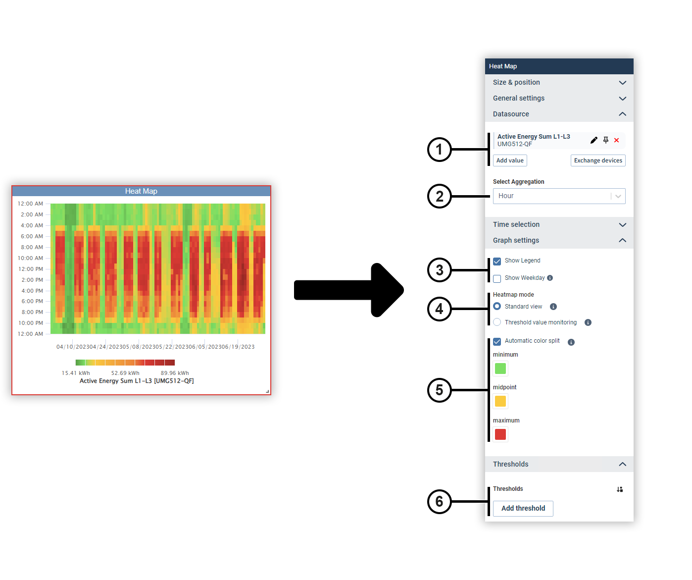
|
Position |
Description |
|
1 |
Displays the selected measured values with display name, source device and color. Move the mouse over a data source to edit or remove it (see
Measured Value Selection
). Data sources can be pinned on dashboards. Devices from pinned data sources remain unchanged in the dashboard’s presentation mode. This allows you to make comparisons during the presentation, for example, using the temporary device swap. |
|
2 |
Defines the aggregation of the measured values. |
|
3 |
Displays the legend of the coloring or the designation of the measured value below the chart. |
|
4 |
Changes the view mode. |
|
5 |
Sets the coloring of the cells. in the standard view, the color distribution can be selected as desired or determined automatically. |
|
6 |
Defines threshold values for threshold value monitoring. The respective threshold value and color can be set as desired. |
Histogram
A histogram shows the statistical frequency of historical measured values in a certain time interval. This allows you to identify trends, patterns and deviations.
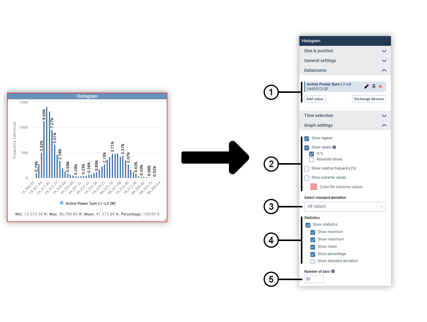
|
Position |
Description |
|
1 |
Displays the selected measured values with display name, source device and color. Move the mouse over a data source to edit or remove it (see
Measured Value Selection
). Data sources can be pinned on dashboards. Devices from pinned data sources remain unchanged in the dashboard’s presentation mode. This allows you to make comparisons during the presentation, for example, using the temporary device swap. |
|
2 |
Defines the way the chart is displayed. |
|
3 |
Defines which standard deviation is used. |
|
4 |
Defines the way the statistics values are displayed. |
|
5 |
Defines how many columns are displayed. The display is limited to 500 columns. |
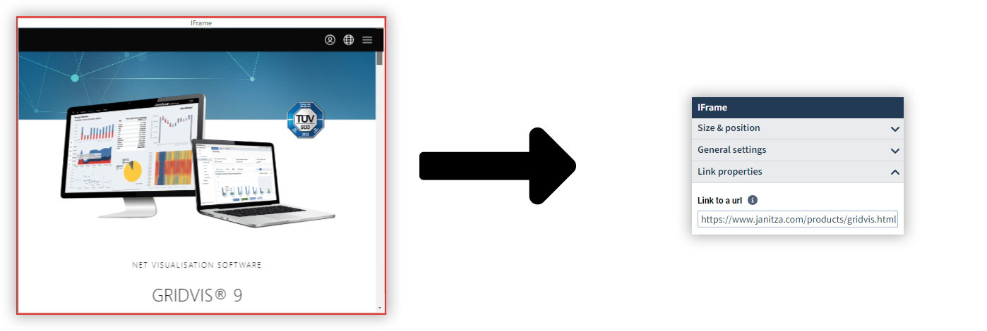
IFrame (for dashboards only)
IFrame is used to display an item of content on the dashboard with which you can interact, such as a web page or PDF. You need a web address (URL) to the content for this. It is also possible to embed dashboards from the previous GridVis version.
You can only use websites with HTTPS encryption if HTTPS encryption is enabled in GridVis (see
HTTPS Encryption
).
Attention!
The extended security for dashboards prevents potentially malicious scripts from being loaded from other websites or potentially malicious code being executed by dashboard elements (see System settings )!
Note that this will prevent certain functions from being available, such as embedding maps or web pages that require a login (including GridVis internal pages)!
Before disabling this protection mechanism, make sure that the code used has been implemented by trustworthy persons and does not represent any threat!
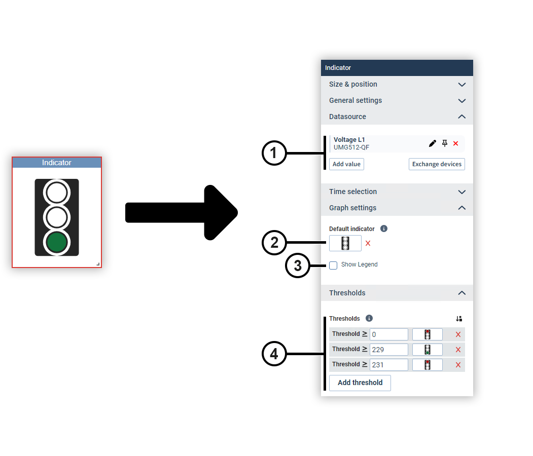
Indicator
The Indicator object displays images for specific value ranges of a measured value. Typical applications are the display of traffic lights or switch positions.
T
he measured value is displayed on dashboards in edit mode and hidden in presentation mode.
To be able to use images, they must be stored in the picture management (see
Picture Manager
).
|
Position |
Description |
|
1 |
Displays the selected measured values with display name, source device and color. Move the mouse over a data source to edit or remove it (see
Measured Value Selection
). Data sources can be pinned on dashboards. Devices from pinned data sources remain unchanged in the dashboard’s presentation mode. This allows you to make comparisons during the presentation, for example, using the temporary device swap. |
|
2 |
Defines which image is displayed when the measured value does not fall within any of the value ranges. |
|
3 |
Displays the designation of the measured value below the indicator. |
|
4 |
Defines which images are displayed for certain value ranges. |
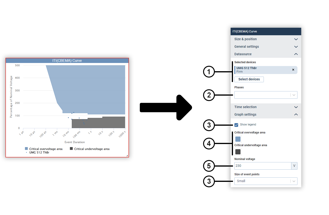
ITI(CBEMA) curve
The ITI(CBEMA) curve describes the maximum voltage deviation in relation to the event duration that an electronic device must be able to tolerate. This means it assists in the evaluation of events in relation to the permissible tolerances.
|
Position |
Description |
|
1 |
Displays the selected device. Move the mouse over the device to remove it. |
|
2 |
Filters the displayed events by the phase in which they occurred. |
|
3 |
Defines the way the chart is displayed. |
|
4 |
Defines the coloring of the two color areas. |
|
5 |
Defines the nominal voltage. |
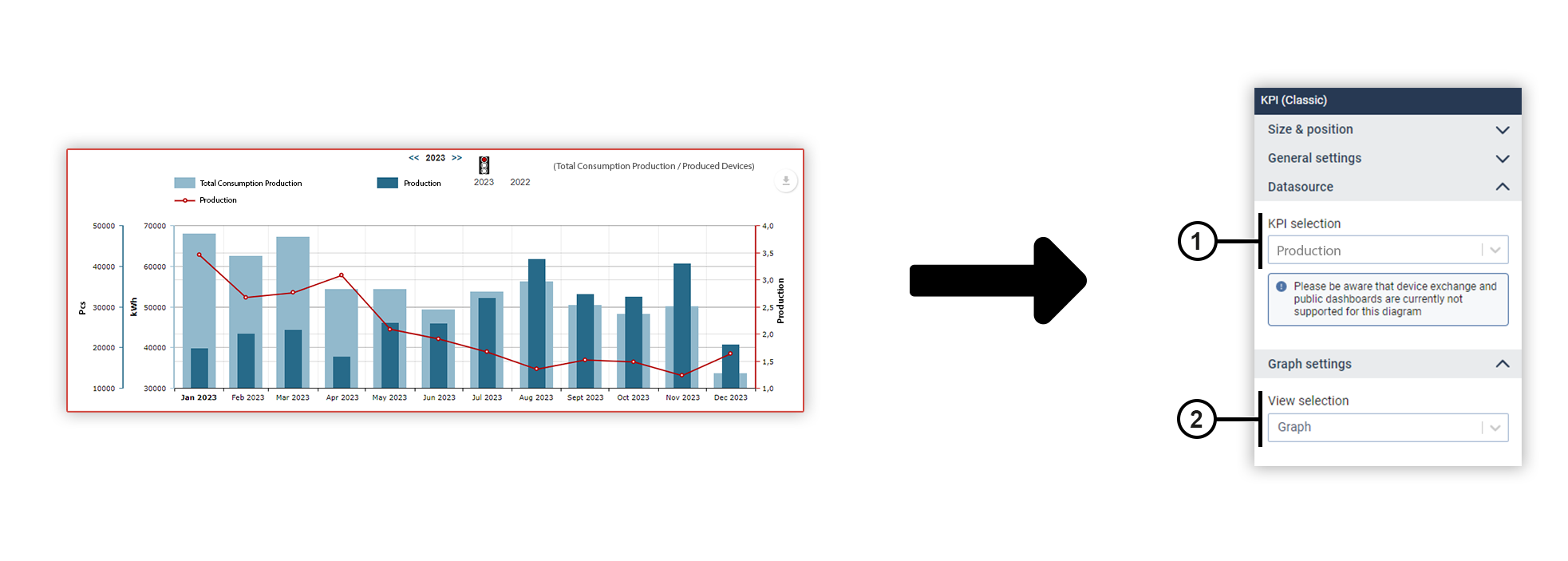
KPI (Classic) (from GridVis edition Expert)
You can use the KPI object to visualize KPIs on dashboards and reports .
|
Position |
Description |
|
1 |
Displays the selected KPI. Select the desired KPI from the drop-down menu. You can create new KPIs in the KPI Manager . Note Device exchange and shared dashboards are currently not supported for the KPI object. |
|
2 |
Switches the view between graph and table.
|
Pie chart
You can use a pie chart to display measured values of the same type as segments of a circle and set them in relation to each other.
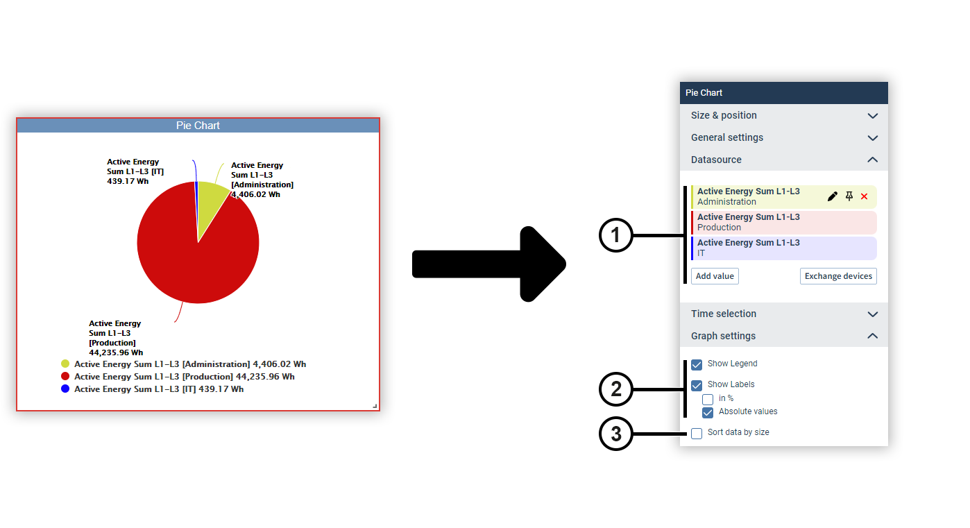
|
Position |
Description |
|
1 |
Displays the selected measured values with display name, source device and color. Move the mouse over a data source to edit or remove it (see
Measured Value Selection
). Data sources can be pinned on dashboards. Devices from pinned data sources remain unchanged in the dashboard’s presentation mode. This allows you to make comparisons during the presentation, for example, using the temporary device swap. |
|
2 |
Defines the way the chart is displayed. |
|
3 |
Arranges the circle sectors by size. |
Line chart
You can use a line chart to display different measured values as a chronological progression.
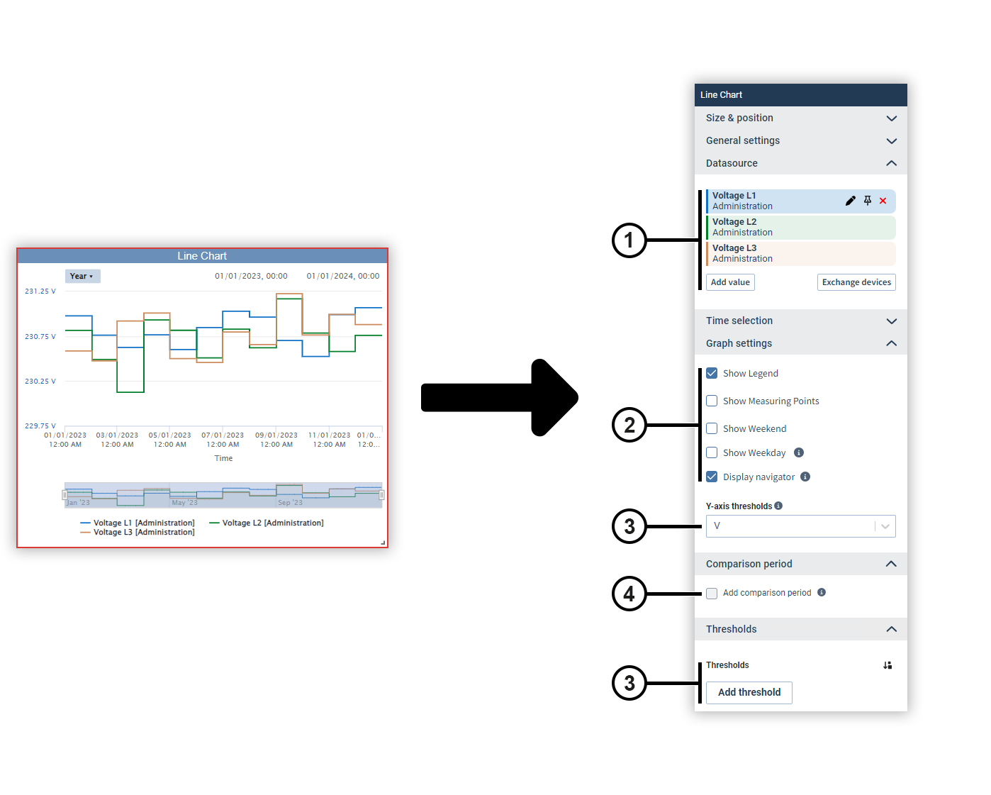
|
Position |
Description |
|
1 |
Displays the selected measured values with display name, source device and color. Move the mouse over a data source to edit or remove it (see
Measured Value Selection
). Data sources can be pinned on dashboards. Devices from pinned data sources remain unchanged in the dashboard’s presentation mode. This allows you to make comparisons during the presentation, for example, using the temporary device swap. |
|
2 |
Defines the way the chart is displayed. The navigator is displayed only in presentation mode. Use the navigator to zoom in the chart and move the displayed time section. Use the shortcut buttons to set the time section to specific time periods. |
|
3 |
Displays threshold value lines in the chart. The respective threshold value and color can be set as desired. |
|
4 |
Sets the comparison period.
You can use the comparison period to display additional measured values that lie in a specific period before the current measured values. Note To use the comparison period, only one measured value may be selected in the chart. |
Stacked line chart
A stacked line chart allows you to display the time course of different measured values of the same type on top of each other.
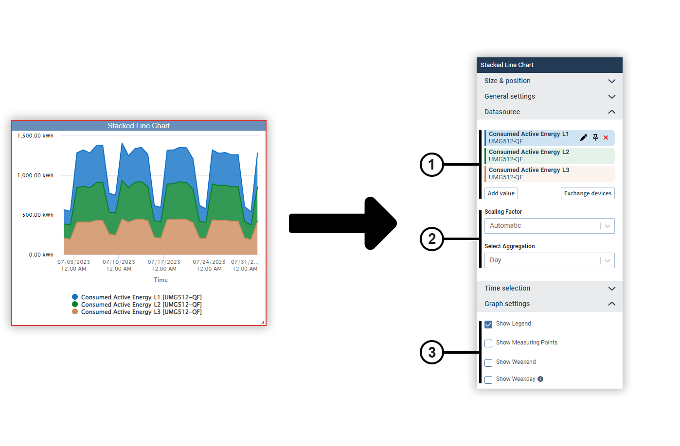
|
Position |
Description |
|
1 |
Displays the selected measured values with display name, source device and color. Move the mouse over a data source to edit or remove it (see
Measured Value Selection
). Data sources can be pinned on dashboards. Devices from pinned data sources remain unchanged in the dashboard’s presentation mode. This allows you to make comparisons during the presentation, for example, using the temporary device swap. |
|
2 |
Automatically determines the scaling of the measured values or sets a fixed scaling factor. |
|
3 |
Defines the way the chart is displayed. |
Modbus Value Writing (for dashboards only) (from GridVis edition Expert)
You can use this object to write parameters and statuses to a Modbus address via a manual input field or predefined action buttons and thus configure a device via GridVis.
Note
Users who are not logged in and who access a shared dashboard via a link cannot use the Modbus write function.
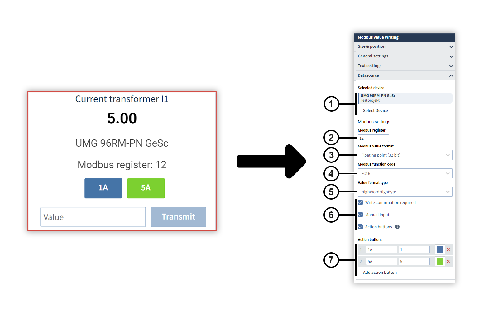
|
Position |
Description |
|
1 |
Displays the selected device. Move the mouse over the device to remove it. |
|
2 |
Displays the address of the Modbus register. Make sure that the address you are writing to is also writable (WR). If an address is read-only (RD), it cannot be written to. |
|
3 |
Selects the Modbus value format. The Modbus value format depends on the set register. The value format of the registers can be found in the Modbus address list. |
|
4 |
Selects the Modbus function code to be used:
|
|
5 |
Defines the value format. |
|
6 |
Attention! Do not use this object to describe Modbus addresses of safety-critical systems. This can lead to measurement errors and data loss, among other things. |
|
7 |
Adds action buttons to the object. You can use action buttons to transfer values without having to enter them manually. The action buttons are retained when the register is changed. The name of an action button can be freely selected; the possible values can be taken from the Modbus address list. The colors of the action buttons can be freely selected using the color picker.
|
Multiple linear regression (from GridVis edition Expert)
Multiple regression analysis allows several independant variables to be checked for their correlation with a dependent variable. In addition, graphical representations in the form of scatter charts can be used for tabular model diagnosis. In the graphical representation, a distinction is made between residual versus time diagrams and residual versus fitted value diagrams.
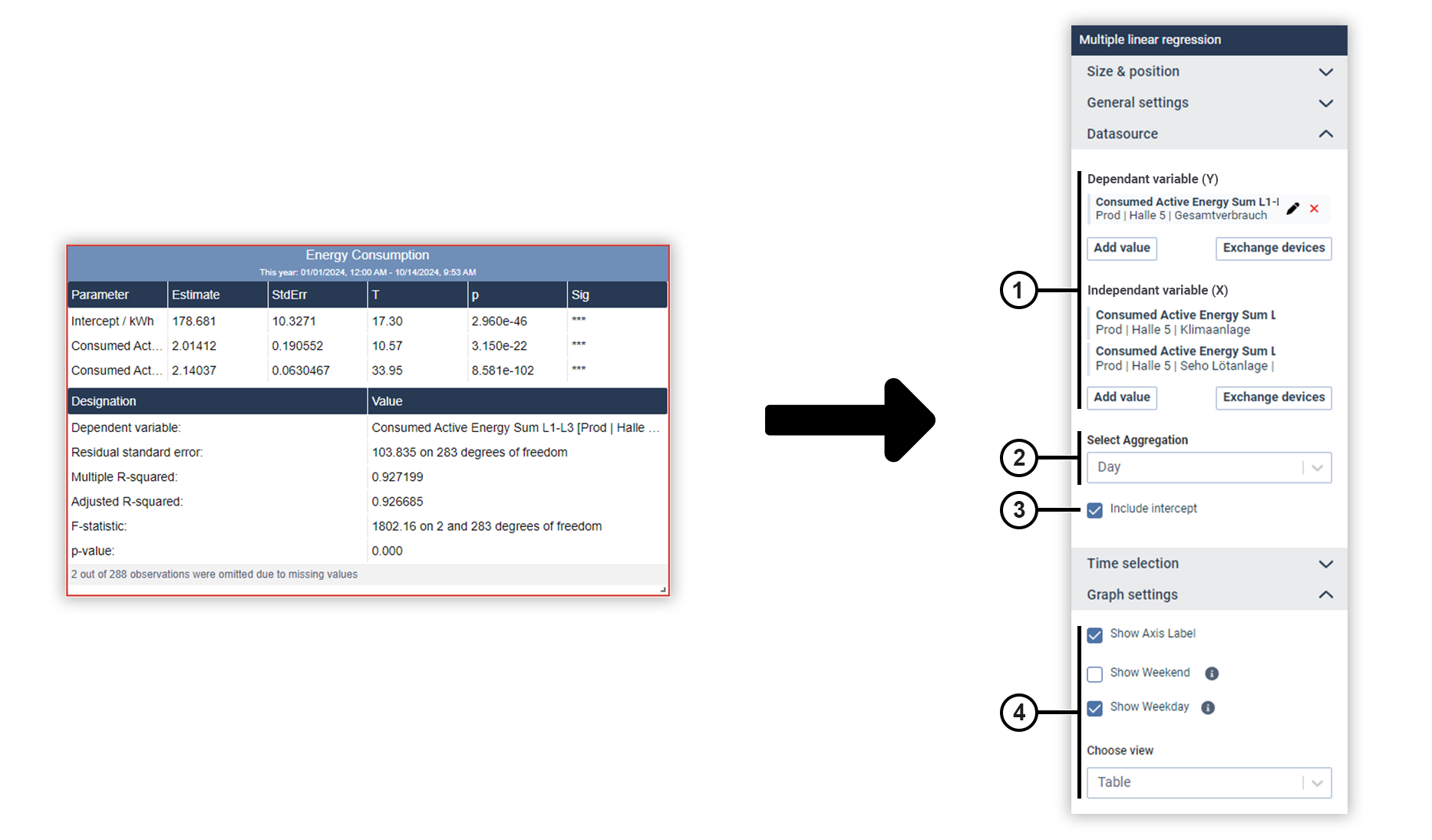
|
Position |
Description |
|
1 |
Displays the selected measured values with display name, source device and color. Move the mouse over a data source to edit or remove it (see
Measured Value Selection
). Data sources can be pinned on dashboards. Devices from pinned data sources remain unchanged in the dashboard’s presentation mode. This allows you to make comparisons during the presentation, for example, using the temporary device swap.
|
|
2 |
Defines the aggregation of the measured values. |
|
3 |
The intercept is the value of the dependent variable if all independent variables were equal to zero. If the checkbox is not ticked, the dependent variable is hidden. |
|
4 |
Defines the display of the data . Under Choose view, select whether the data should be displayed in a table or as a scatter chart (residuals versus time or residuals versus fitted values). |
Numerical value
The Numerical value object represents a measured value. You can optionally add further information to the measured value.
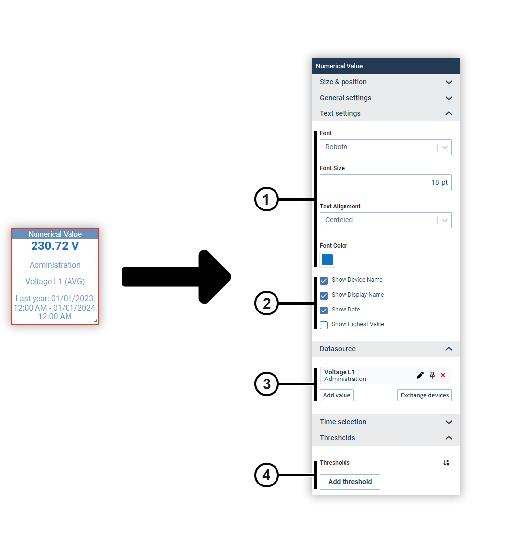
|
Position |
Description |
|
1 |
Sets the text formatting. |
|
2 |
Defines which additional information about the measured value is displayed. |
|
3 |
Displays the selected measured values with display name, source device and color. Move the mouse over a data source to edit or remove it (see
Measured Value Selection
). Data sources can be pinned on dashboards. Devices from pinned data sources remain unchanged in the dashboard’s presentation mode. This allows you to make comparisons during the presentation, for example, using the temporary device swap. |
|
4 |
Sets the background colors for certain value ranges. |
Harmonics (column chart)
This object is used to evaluate harmonics according to the limit values of the EN50160 standard. The harmonics are displayed in a column chart.
The harmonics per phase and individual limit value violations are displayed in a tooltip above the columns.
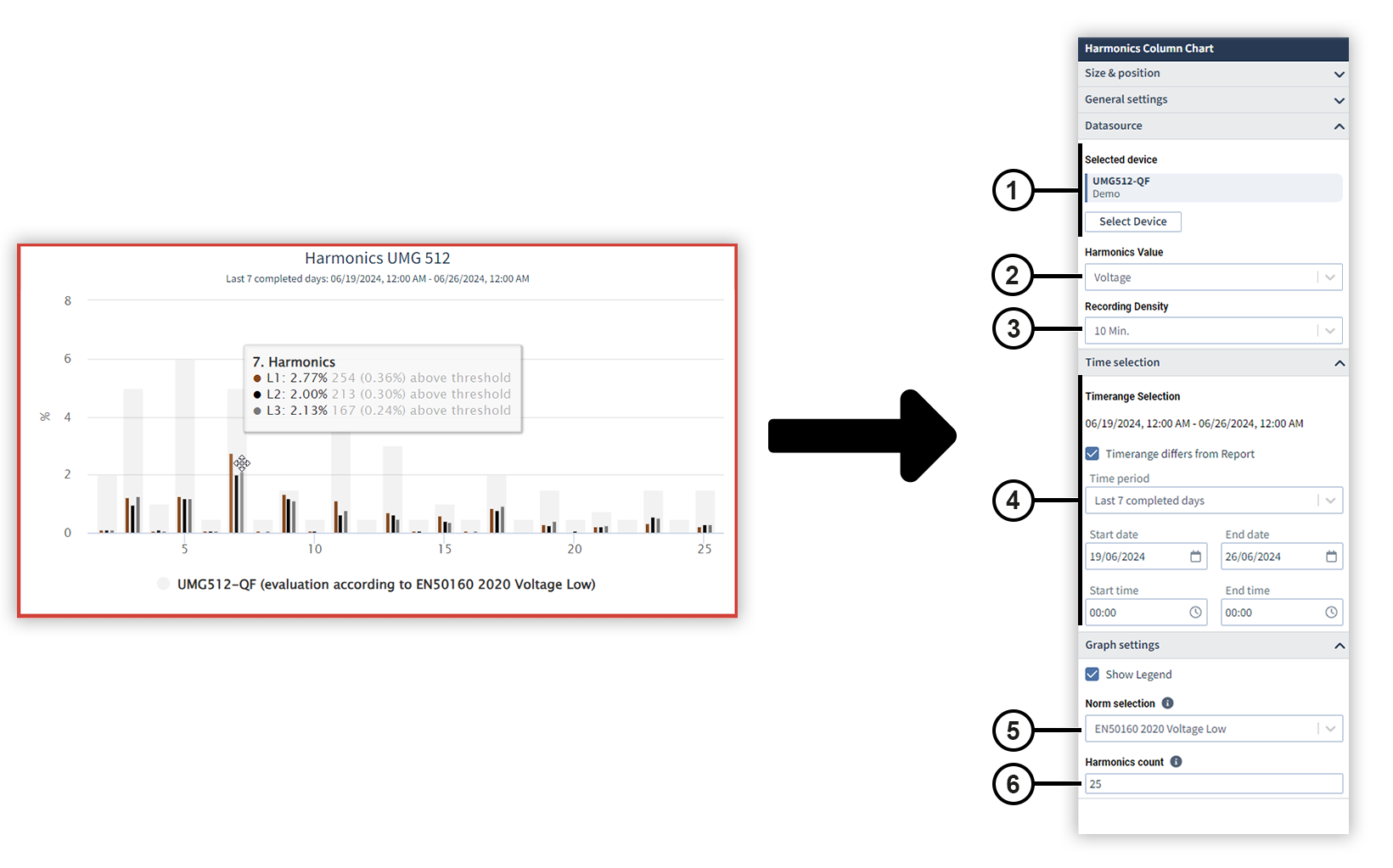
|
Position |
Description |
|
1 |
Displays the selected device. Move the mouse over the device to remove it. |
|
2 |
Specifies whether current or voltage values are analyzed. |
|
3 |
Specifies the recording density with which the data are displayed. Depending on the device configuration, the data is recorded using different recording densities. |
|
4 |
Specifies the time period of the data to be viewed. Note The EN50160 standard specifies a period of one week (last 7 complete days). This means the object deviates from the preset global time period. |
|
5 |
In the drop-down menu, select the standard according to whose limit values the chart is to be evaluated. The selected standard appears in the chart legend. Note
|
|
6 |
The number of harmonics depends on the selected standard. |
Level meter
Use the level meter to show a measured value within freely configurable limits. Optionally, you can assign an individual color to certain value ranges.
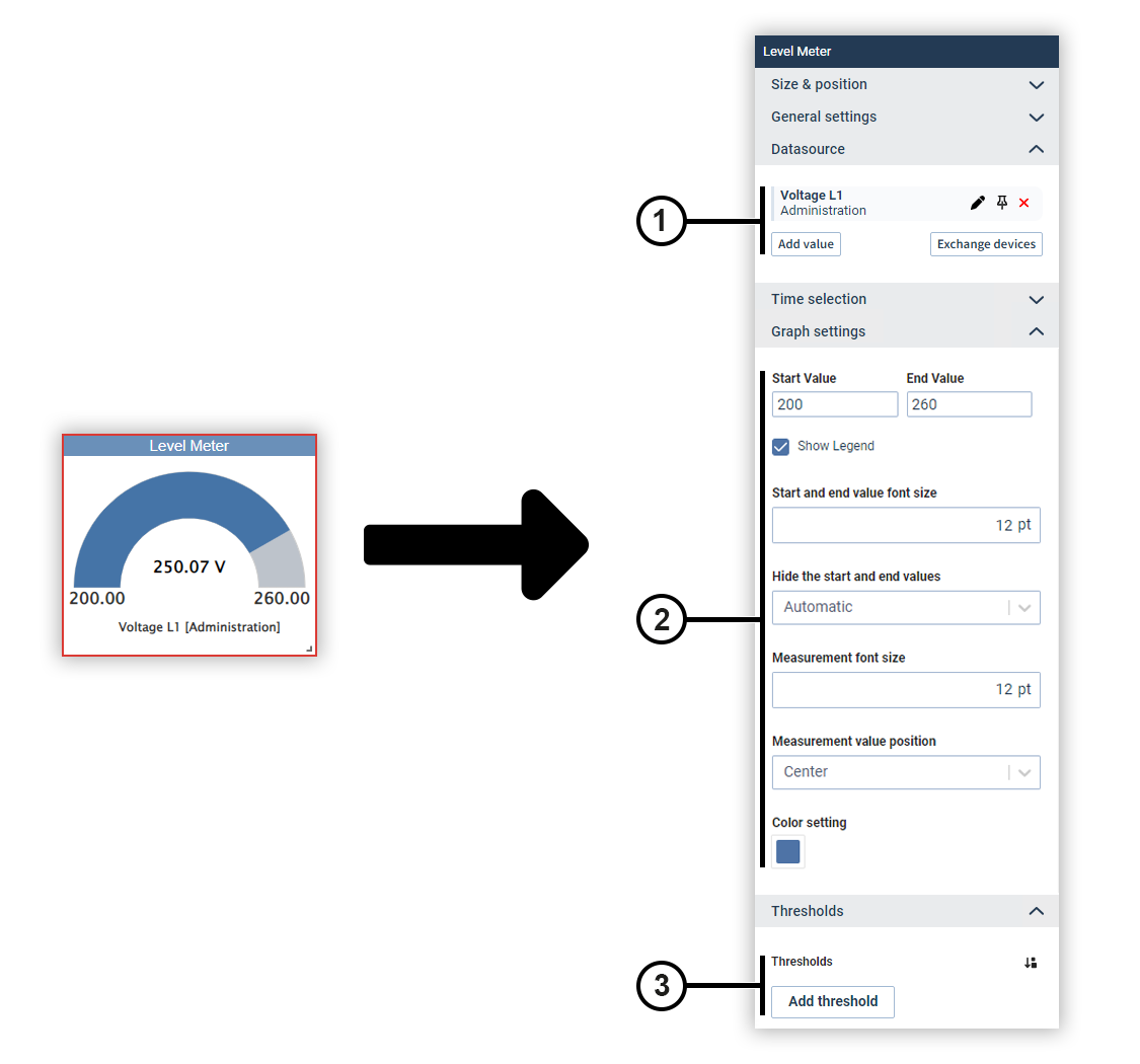
|
Position |
Description |
|
1 |
Displays the selected measured values with display name, source device and color. Move the mouse over a data source to edit or remove it (see
Measured Value Selection
). Data sources can be pinned on dashboards. Devices from pinned data sources remain unchanged in the dashboard’s presentation mode. This allows you to make comparisons during the presentation, for example, using the temporary device swap. |
|
2 |
Defines the limits of the display and the way the chart is displayed. |
|
3 |
Sets the colors for certain value ranges. |
Regression scatter chart (from GridVis edition Expert)
Use the regression scatter chart to examine two measured values to see if there is a relationship between them. The measured values are displayed as a scatter chart with a plotted regression line.
You can show the equation of the regression line, the coefficient of determination, and an interpretation of the strength of the relationship below the chart.
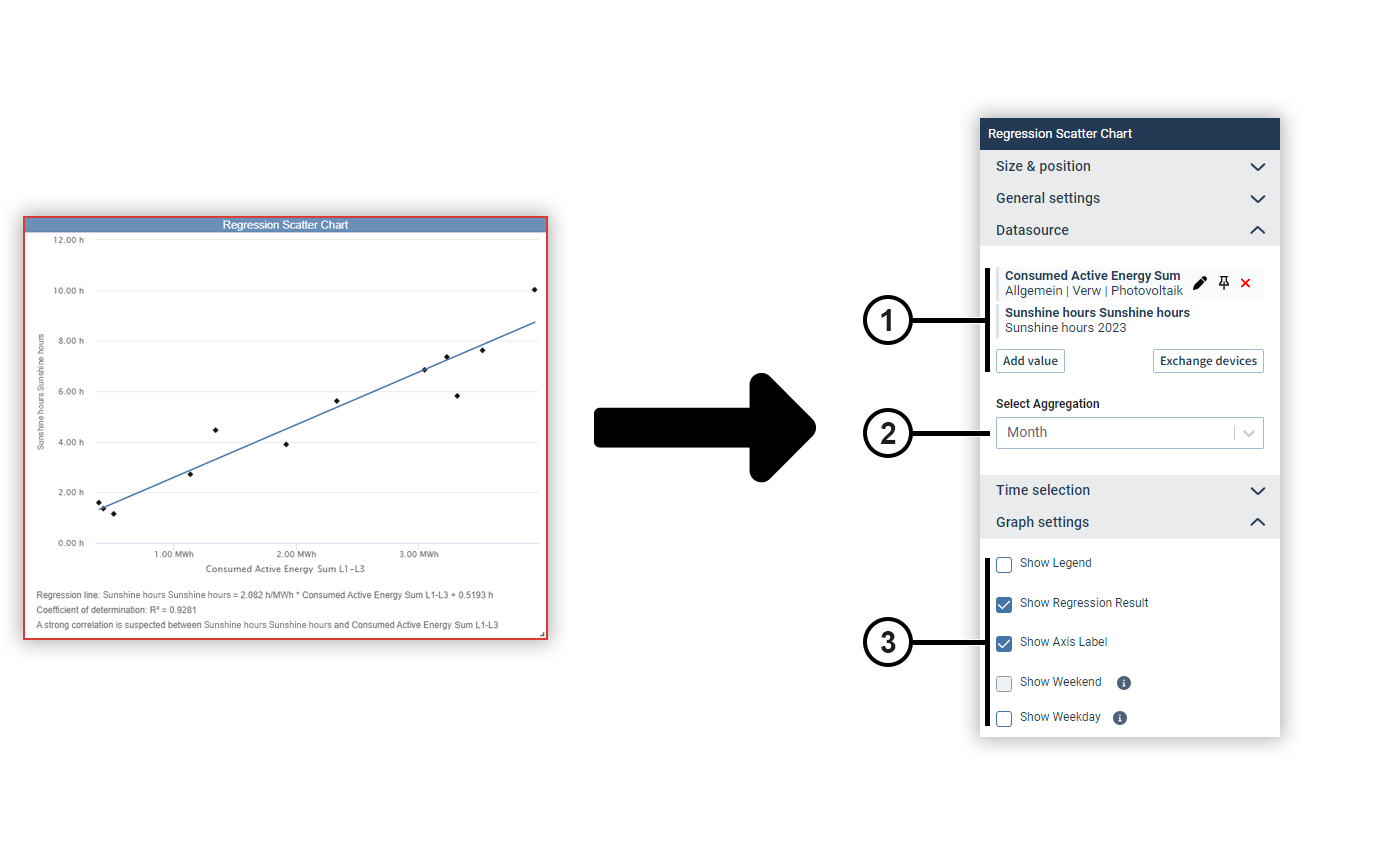
|
Position |
Description |
|
1 |
Displays the selected measured values with display name, source device and color. Move the mouse over a data source to edit or remove it (see
Measured Value Selection
). Data sources can be pinned on dashboards. Devices from pinned data sources remain unchanged in the dashboard’s presentation mode. This allows you to make comparisons during the presentation, for example, using the temporary device swap. |
|
2 |
Defines the aggregation of the measured values. |
|
3 |
Defines the display of the chart and additional information about the regression result. |
Sankey (Classic) (from GridVis edition Expert)
You can use the Sankey object to integrate Sankey diagrams into dashboards and reports .
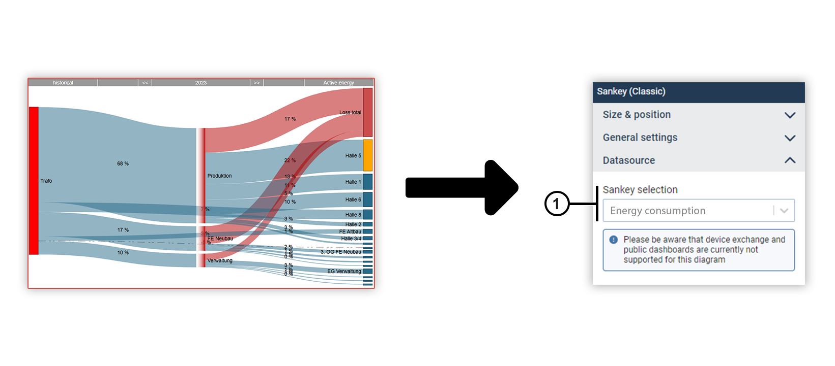
|
Position |
Description |
|
1 |
Displays the selected Sankey diagram. Select the desired Sankey from the drop-down menu. Create new Sankeys in the Sankey Manager . Note Device exchange and shared dashboards are currently not supported for the Sankey object. |
Column chart
You can use a column chart to display measured values of the same type as columns and set them in relation to each other. Optionally, you can add a measured value as a reference line.
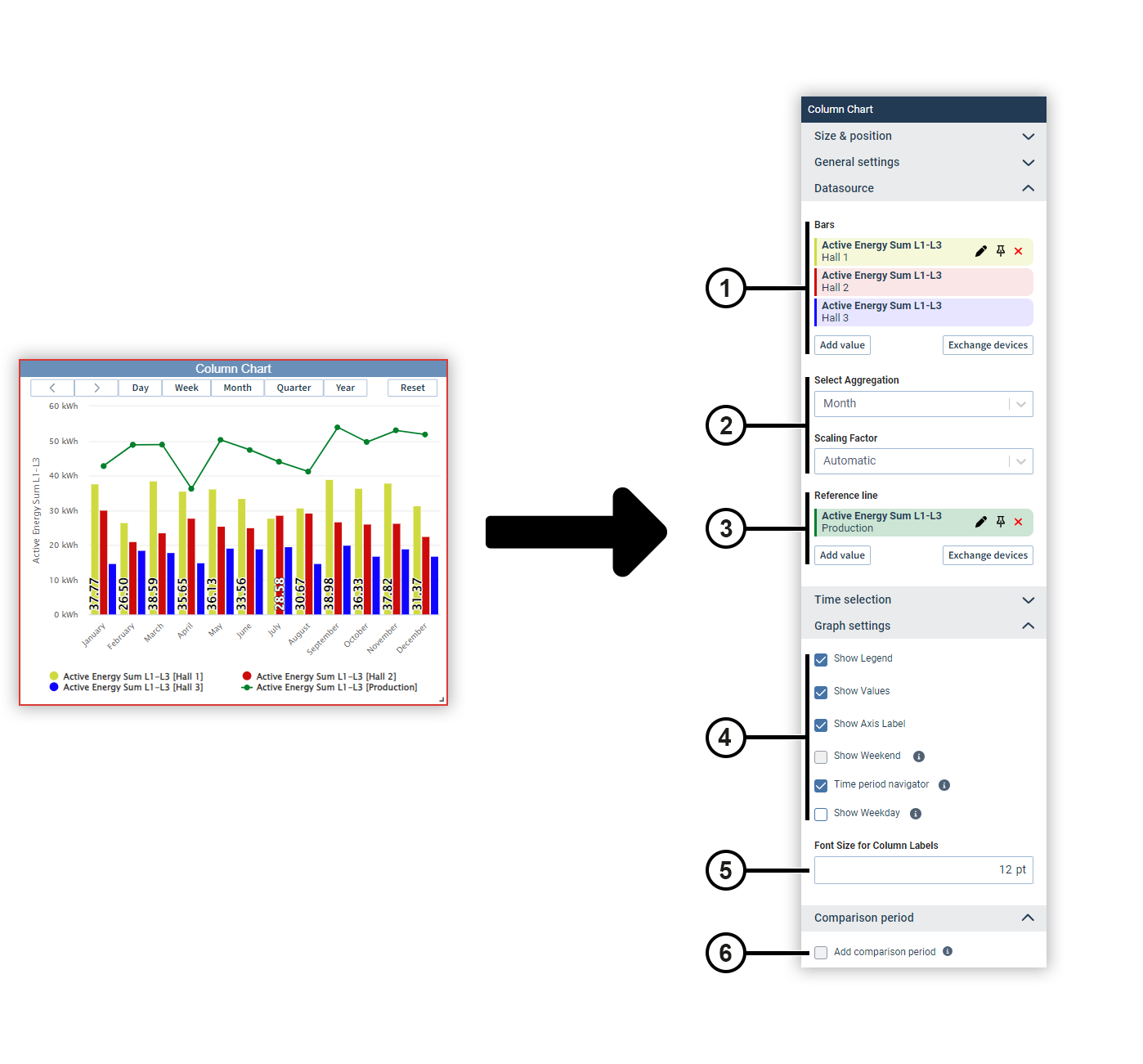
|
Position |
Description |
|
1 |
Displays the selected measured values with display name, source device and color. Move the mouse over a data source to edit or remove it (see
Measured Value Selection
). Data sources can be pinned on dashboards. Devices from pinned data sources remain unchanged in the dashboard’s presentation mode. This allows you to make comparisons during the presentation, for example, using the temporary device swap. |
|
2 |
Automatically determines the scaling of the measured values or sets a fixed scaling factor. |
|
3 |
Displays the measured value selected as the reference line with the display name, source device and color. Move the mouse over a data source to edit or remove it (see
Measured Value Selection
). Data sources can be pinned on dashboards. Devices from pinned data sources remain unchanged in the dashboard’s presentation mode. This allows you to make comparisons during the presentation, for example, using the temporary device swap. |
|
4 |
Defines the way the chart is displayed. The navigator is displayed only in presentation mode. Use the navigator to move the displayed time section. Use the shortcut buttons to set the time section to specific time periods. |
|
5 |
Sets the size of the column label. |
|
6 |
Sets the comparison period.
You can use the comparison period to display additional measured values that lie in a specific period before the current measured values. Note To use the comparison period, only one measured value may be selected in the chart. |
Stacked column chart
You can use a stacked column chart to display measured values of the same type as columns stacked on top of each other and set them in relation to each other. Optionally, you can add a measured value as a reference line.
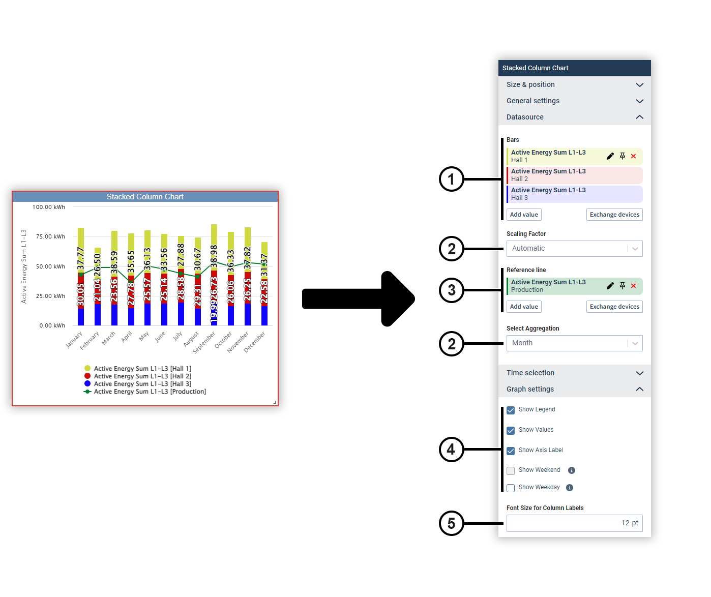
|
Position |
Description |
|
1 |
Displays the selected measured values with display name, source device and color. Move the mouse over a data source to edit or remove it (see
Measured Value Selection
). Data sources can be pinned on dashboards. Devices from pinned data sources remain unchanged in the dashboard’s presentation mode. This allows you to make comparisons during the presentation, for example, using the temporary device swap. |
|
2 |
Automatically determines the scaling of the measured values or sets a fixed scaling factor. |
|
3 |
Displays the measured value selected as the reference line with the display name, source device and color. Move the mouse over a data source to edit or remove it (see
Measured Value Selection
). Data sources can be pinned on dashboards. Devices from pinned data sources remain unchanged in the dashboard’s presentation mode. This allows you to make comparisons during the presentation, for example, using the temporary device swap. |
|
4 |
Defines the way the chart is displayed. |
|
5 |
Sets the size of the column label. |
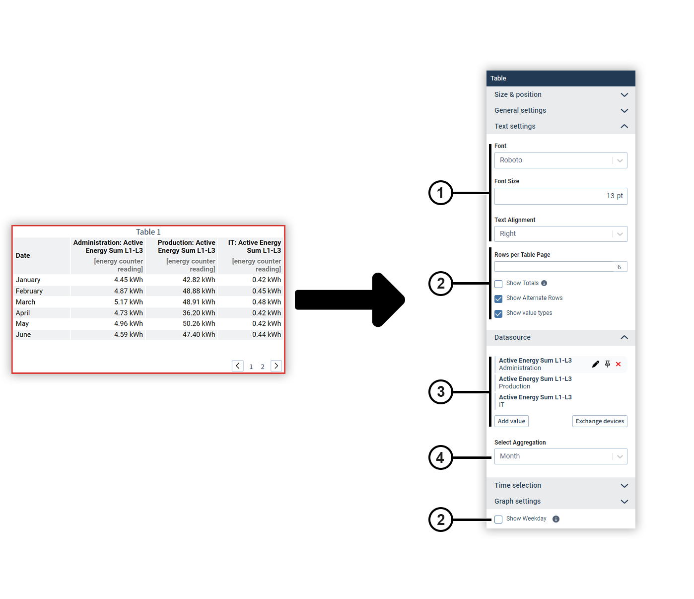
Table (from GridVis edition Expert)
Display different measured values in a table and optionally display their totals and subtotals. You can split a table into several pages.
|
Position |
Description |
|
1 |
Sets the text formatting. |
|
2 |
Defines the appearance and splitting of the table. This can be used, for example, to split longer tables into several report pages. Totals and subtotals are only output for energy values. Note The daily consumption can be calculated either by the hour or directly. Deviations between the daily consumption and the sum of the hourly consumption can occur, for example, in the event of measurement gaps (see explanation here ). If the table contains more rows than specified in the Rows per Table Page field, a page selection appears below the table. This is only visible in the editing and presentation mode of reports and dashboards. |
|
3 |
Displays the selected measured values with display name, source device and color. Move the mouse over a data source to edit or remove it (see
Measured Value Selection
). Data sources can be pinned on dashboards. Devices from pinned data sources remain unchanged in the dashboard’s presentation mode. This allows you to make comparisons during the presentation, for example, using the temporary device swap. |
|
4 |
Defines the aggregation of the measured values. |
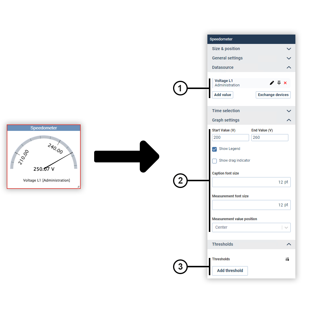
Speedometer
Use the speedometer to show a measured value within freely configurable limits. Optionally, you can assign an individual color to certain value ranges.
|
Position |
Description |
|
1 |
Displays the selected measured values with display name, source device and color. Move the mouse over a data source to edit or remove it (see
Measured Value Selection
). Data sources can be pinned on dashboards. Devices from pinned data sources remain unchanged in the dashboard’s presentation mode. This allows you to make comparisons during the presentation, for example, using the temporary device swap. |
|
2 |
Defines the limits of the display and the way the chart is displayed. |
|
3 |
Sets the colors for certain value ranges. |
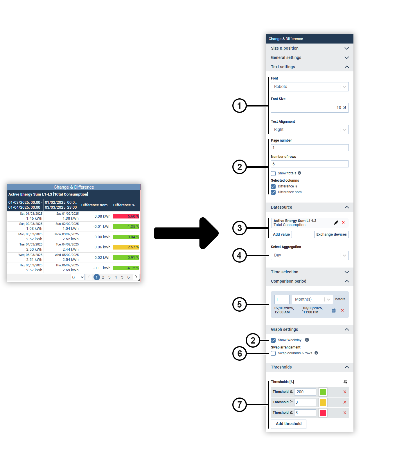
Change & Difference (from GridVis edition Expert)
With the Change & Difference object, you compare the measured values in a defined period of time and display the changes. This allows you to identify trends and abnormalities.
|
Position |
Description |
|
1 |
Sets the text formatting. |
|
2 |
Defines the appearance and splitting of the table. Totals and subtotals are only output for energy values. Note The daily consumption can be calculated either by the hour or directly. Deviations between the daily consumption and the sum of the hourly consumption can occur, for example, in the event of measurement gaps (see explanation here ). The page selection is only visible in the editing and presentation mode of reports and dashboards. |
|
3 |
Displays the selected measured values with display name, source device and color. Move the mouse over a data source to edit or remove it (see
Measured Value Selection
). Data sources can be pinned on dashboards. Devices from pinned data sources remain unchanged in the dashboard’s presentation mode. This allows you to make comparisons during the presentation, for example, using the temporary device swap.
|
|
4 |
Defines the aggregation of the measured values. |
|
5 |
Defines the period to which the measured values are compared. |
|
6 |
Swaps the columns and rows of the table. Since the number of columns is limited, this function allows you to either display any number of comparisons or devices in the rows of the table. |
|
7 |
Sets the colors used to display certain value ranges of the differences. |
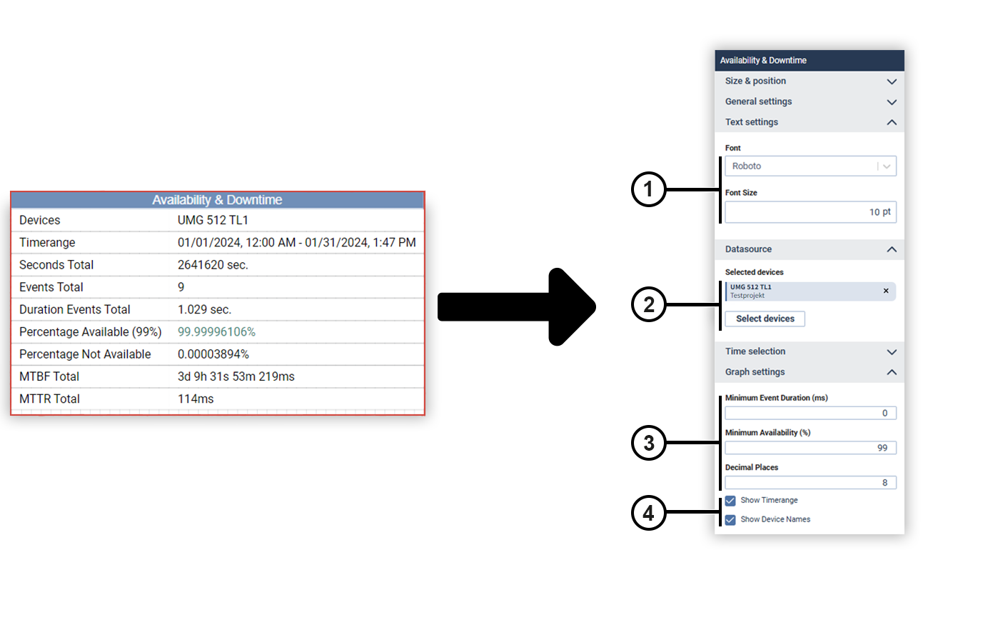
Availability and downtime (from GridVis edition Expert)
You can use the Availability & downtime object to statistically evaluate the availability of your grid voltage. Important key performance indicators such as mean time between failure (MTBF) and mean time to repair (MTTR) are also calculated and displayed.
|
Position |
Description |
|
1 |
Defines the text formatting. |
|
2 |
Displays the selected device. Move the mouse over the device to remove it. |
|
3 |
Specifies the minimum event duration, the minimum availability and the number of decimal places. Note The minimum availability can be determined precisely by the user. If the entered value is not achieved, the availability is displayed in red in the table. If the availability is above the entered value, it is displayed in green. |
|
4 |
Specifies whether the time range and the device names are displayed in the object. |
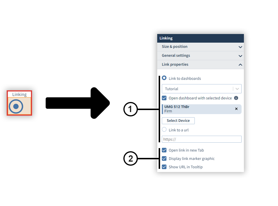
Linking (for dashboard only)
The Linking object is a transparent clickable area that links to an external resource or another dashboard. The link can be opened in a new tab or marked by a graphic.
|
Position |
Description |
|
1 |
Defines the destination of the link. |
|
2 |
Defines the behavior of the link. |
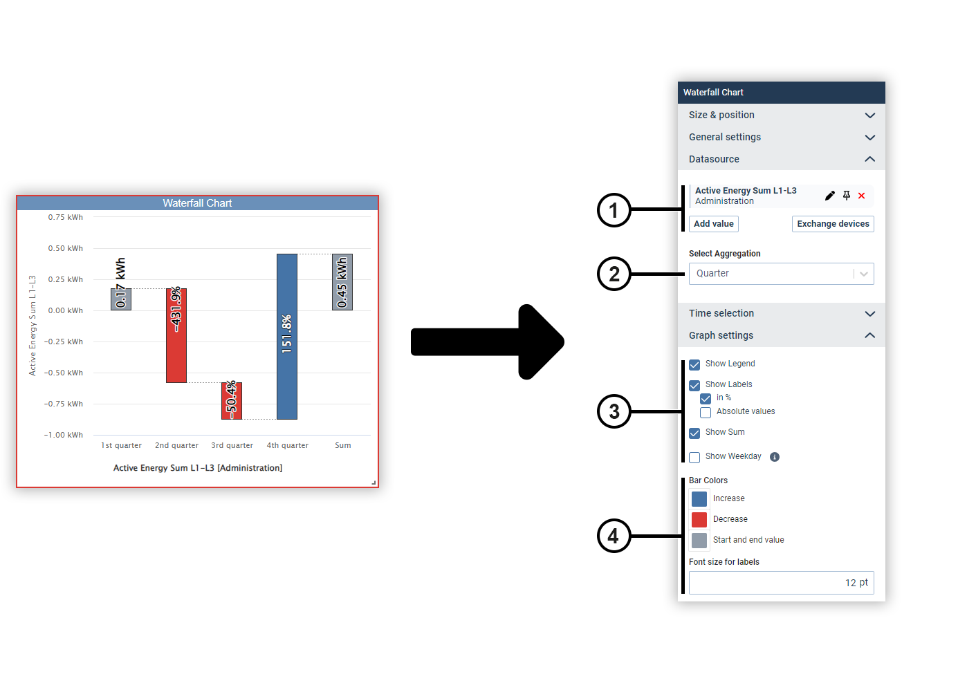
Waterfall chart (from GridVis edition Expert)
A waterfall chart shows the development of a measured value over time by increasing or decreasing steps.
|
Position |
Description |
|
1 |
Displays the selected measured values with display name, source device and color. Move the mouse over a data source to edit or remove it (see
Measured Value Selection
). Data sources can be pinned on dashboards. Devices from pinned data sources remain unchanged in the dashboard’s presentation mode. This allows you to make comparisons during the presentation, for example, using the temporary device swap. |
|
2 |
Defines the aggregation of the measured values. |
|
3 |
Defines the way the chart is displayed. |
|
4 |
Sets the colors of the columns and the size of the column label. |